Car Insurance

-

Mobile App & Web

Car Insurance

-

Mobile App & Web

Car Insurance

-

Mobile App & Web

Car Insurance

-

Mobile App & Web

Car Insurance

-

Mobile App & Web

Redesigning Car Insurance to make retailers life easier

Redesigning Car Insurance to make retailers life easier

Redesigning Car Insurance to make retailers life easier

Redesigning Car Insurance to make retailers life easier

Redesigning Car Insurance to make retailers life easier

The Brief

PayNearby is an Indian fintech company that partners with local retail stores to offer digital financial services to their communities, including cash withdrawals, deposits, money transfers, savings, insurance, travel, and government benefits.

Insurance Nearby is a subsidiary of Nearby Technologies and provides simple insurance products instantly through mobile apps and web services.

Problems

Retailers had to go through a lengthy process to get quotes from Insurers


Unnecessary cognitive load for the Retailers during adding customers' vehicle details

Objectives

Research to find opportunities

Make flow simpler for the retailers

Introducing Add-ons and Accessories as a feature

Design an end-to-end Progressive web application

Approach

Starting with User Journey Map

Starting with User Journey Map

Starting with User Journey Map

Starting with User Journey Map

To understand retailers pain points and Opportunities

To understand retailers pain points and Opportunities

Key takeaways

Retailers might not realize that renewing the policy for existing customers is in the same flow as adding new ones


The license & registration page has unnecessary confusion


Entering customer vehicle details requires filling out a very long form

Conducting Cognitive Walkthrough

Conducting Cognitive Walkthrough

Conducting Cognitive Walkthrough

Conducting Cognitive Walkthrough

To validate Pain points from User Journey Map and to get more insights, i conducted Cognitive walkthrough

To validate Pain points from User Journey Map and to get more insights, i conducted Cognitive walkthrough

Key takeaways

Have a separate flow for existing customer


Selecting vehicle type and registration status should also be a separate flow


Make forms much simpler by making it step by step process rather than showing everything to the retailer


Competitive Analysis

Competitive Analysis

Competitive Analysis

Competitive Analysis

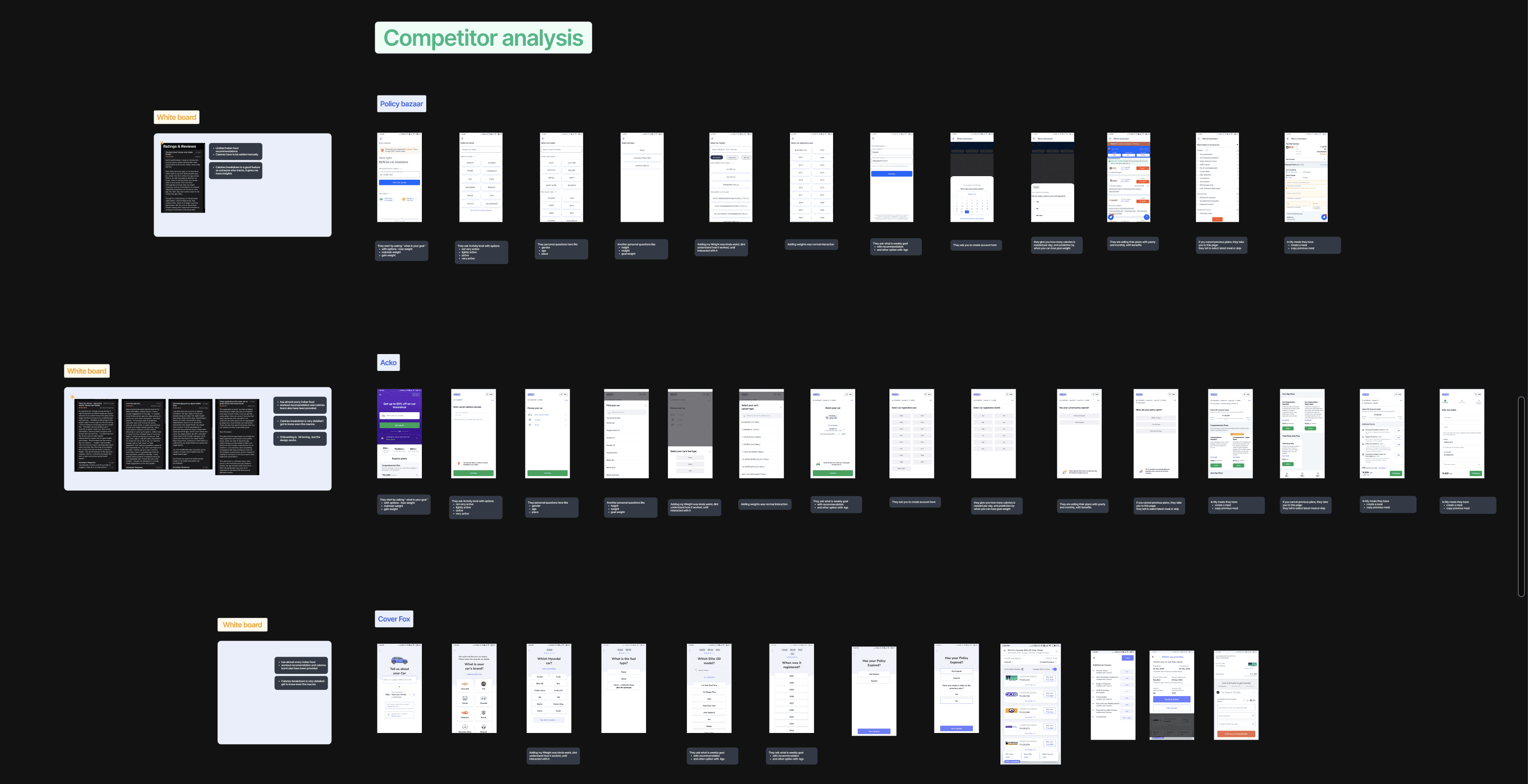
Conducted Competitive analysis to find possible solutions to the pain points and to find design inspirations

Conducted Competitive analysis to find possible solutions to the pain points and to find design inspirations

Key takeaways

Found a common mental model of entering customer car details in all 3 indirect competitors (which also solves the long form-filling process )


There was a separate entry for Renew policy for Existing customers and a separate entry for New vehicles without registration which solves unnecessary confusion on that page


Gave me an idea for Design inspiration for my Redesigns


Wireframes

Wireframes

Wireframes

Wireframes

Based on Data and Insights from User Journey map, cognitive walkthrough and competitive analysis, started working on wireframes

Based on Data and Insights from User Journey map, cognitive walkthrough and competitive analysis, started working on wireframes

Key Points

Through an iterative design process, I refined the wireframes by gathering feedback from the Design team, Product Managers, and Developers. This resulted in more effective wireframes.


My collaborative approach, with regular communication among different teams and stakeholders, helped me create a cohesive and successful product.


Final User Experience

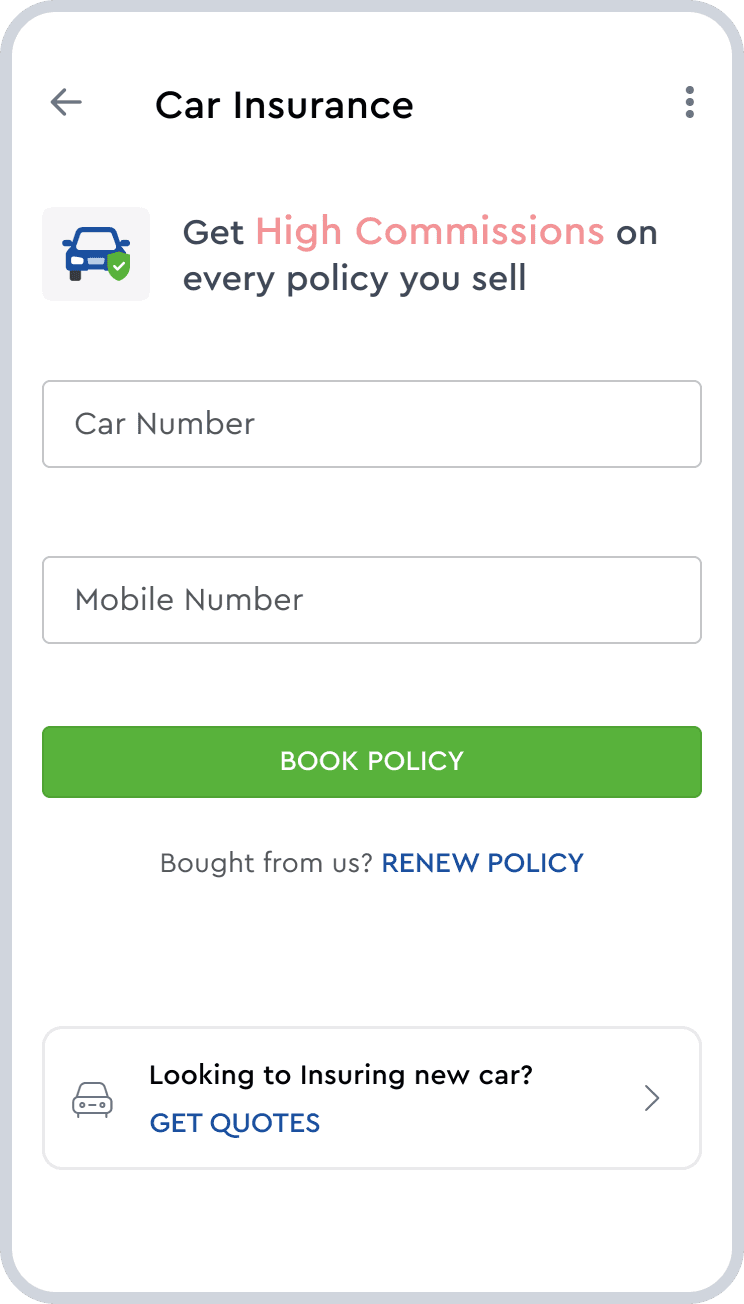
Car Insurance Homepage

Car Insurance Homepage

By creating two different flows

- one for renewing existing policies
- one for insuring new cars

I addressed the issues identified in the User Journey map and Cognitive walkthrough,
which solves the problem of retailers having to choose between multiple options on same page

By creating two different flows

- one for renewing existing policies
- one for insuring new cars

I addressed the issues identified in the User Journey map and Cognitive walkthrough,
which solves the problem of retailers having to choose between multiple options on same page

Customer vehicle details

The Guided way to enter vehicle details allows retailers to comfortably fill in details without having to worry about long forms

Add-ons page

Add-ons page

Introducing a new feature for retailers to provide their customers with more options and accessories for their vehicles

Offering multiple add-ons and accessories for customers to customize their vehicles according to their preferences

Providing Priority Business requirements for retailers to get their customers' orders fulfilled as soon as possible

App Prototype

App Prototype

A well-planned and executed user journey that leads users to their desired outcome with minimal effort and maximum satisfaction.

Intuitive and user-friendly interface design that makes it easy for users to navigate and use the app

A well-planned and executed user journey that leads users to their desired outcome with minimal effort and maximum satisfaction.

Intuitive and user-friendly interface design that makes it easy for users to navigate and use the app

Web Prototype

Web Prototype

Flawless responsiveness across all devices, including desktops, tablets, and mobile phones, ensuring users have a consistent experience regardless of the device they're using

Flawless responsiveness across all devices, including desktops, tablets, and mobile phones, ensuring users have a consistent experience regardless of the device they're using

Customer vehicle details

Creating a step by step entry of Customer details solves problem of retailers having to fill long forms

Car Insurance Homepage

Creating separate flow for renew policy and Insuring new car solves the pain points found from User Journey map and Cognitive walkthrough

Web Prototype

Flawless responsiveness across all devices, including desktops, tablets, and mobile phones, ensuring users have a consistent experience regardless of the device they're using

Add-ons page

Introducing a new feature for retailers to provide their customers with more options and accessories for their vehicles

Offering multiple add-ons and accessories for customers to customize their vehicles according to their preferences

Providing Priority Business requirements for retailers to get their customers' orders fulfilled as soon as possible

App Prototype

A well-planned and executed user journey that leads users to their desired outcome with minimal effort and maximum satisfaction.

Intuitive and user-friendly interface design that makes it easy for users to navigate and use the app

Customer vehicle details

Creating a step-by-step entry of Customer details solves the problem of retailers having to fill long forms

Whats Next?

Whats Next?

Whats Next?

Whats Next?

Whats Next?

Conducting Usability Testing to find improvements and to test if the Retailers are understanding the flow

Measuring where drop off rates in pages to see if retailers are facing any problems

Reducing customer tickets to see if redesign helped reduce tickets

Increase in customer satisfaction as i introduced add-ons and made the flows much simpler

© 2023 Deepak.G

Built by Deepak Gajendiran

© 2023 Deepak.G

Built by Deepak Gajendiran

© 2023 Deepak.G

Built by Deepak Gajendiran

© 2023 Deepak.G

Built by Deepak Gajendiran

© 2023 Deepak.G

Built by Deepak Gajendiran